Do You Know Which Rows in Your SharePoint List Are Hot and Which Cold?
Since the beginning, Cloudriven’s Virta customers have used heat maps to examine which accounts are the most important and how well they’ve been managed lately. The heat map instantly reveals how the sales are weighted as a whole. In addition to monitoring sales, heat maps can be used for various purposes, for instance to visualize employees’ exercise activities.
Data visualization can also be useful in common information work and, to be exact, in SharePoint. That is why we released a Sharepoint app called List Data Visualizer which can be installed into SharePoint directly from Microsoft Office Store. The application allows you to make a treemap-style visualization of any SharePoint list or library. In this blog post I want to highlight various use cases in which List Data Visualizer can be useful for you and your organization.
Play With the Boxes
A heat map is a collection of boxes of different size. The size of the box is defined by how much information it holds inside. The boxes can also be of different color; the colors are used to communicate how important or fresh the information in the box is. Every time new information is put into the box, it grows a bit and the color may change.
Heat map can be used to quickly summarize information from different viewpoints and to detect patterns which would be very difficult to spot in other ways. It is particularly useful when there is a lot of data which can be filtered before the visualization. Here are a couple of examples of use cases and questions that visualization can answer:
[wpcol_1half id=”” class=”” style=””]
Feedback and Evaluation
- Which products or services receive the most feedback?
- Which products receive positive feedback?
- Which products have received feedback recently?
Knowledge Base
- Which products or services have the most knowledge base articles?
- Who has written the most articles?
- Which subjects are the most popular at the moment?
[/wpcol_1half] [wpcol_1half_end id=”” class=”” style=””]
Product Development
- Which product features have been fixed most often?
- Which product features have been the most expensive to fix?
- Is the trend of the product fixes increasing or decreasing?
Event Registration
- Which events are the most popular?
- Which companies have the most attendees?
- How does the amount of registrations vary monthly?
[/wpcol_1half_end]
Projects Put in Order
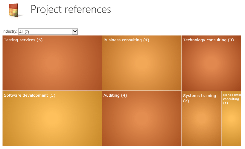
The application development was initiated because one of our customers wanted to demonstrate how their project deliveries had been divided between different industries and offerings. Since a reference story was written in almost all of the cases, the customer decided to maintain the reference stories in a separate SharePoint library which contained the industry and offering metadata fields.
When the content of the reference library is presented as a heat map, the customer can quickly detect which of the industries customer has the most knowledge of and which industries buy which products. Using colors to visualize the freshness of the reference, the customer can also get an overview of which of the industries or offerings are hot and which need activation at the moment.

The boxes are quick links to the filtered library view where you can easily access the documents the box visualizes.
Little Competition Keeps Your Exercise Motivation High
In Cloudriven we use List Data Visualizer to visualize employees’ exercise activity. We input all our exercises in one SharePoint list and we have to define what was the sport, when did the exercise take place and for how long. When we tried to visualize the exercise log, we came to the conclusion that the following visualizations worked the best:
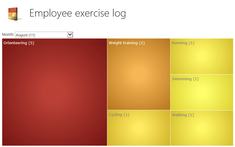
1) The monthly sport distribution shows in general what sports were exercised in which month. The dark red color in the below image tells us that orienteering exercises have been reported quite recently but it’s been a while since the latest weight training − not to mention the other sports! Perhaps the orienteering enthusiasm which began in June in Jukola relay had such an effect on us that the “gamified forest running” was still the most popular sport in August.

2) To monitor the amount of personal exercise activities, the boxes of List Data Visualizer were set to represent every employee’s monthly exercises. The color of the box was set to represent the monthly duration of the exercises on a scale of 0−15 hours. Zero hours would give you a yellow box and 15 or more hours would give you a dark red box. We were then able to keep track of how the colors of our own boxes changed during the month and compare our exercise activity with others.
Give Us More Use Cases, Please!
The above-mentioned use cases are just examples of how data can be visualized in information work. Surely there are a lot more use cases. What relevant information would you want to visualize in your own SharePoint? Comment below!
